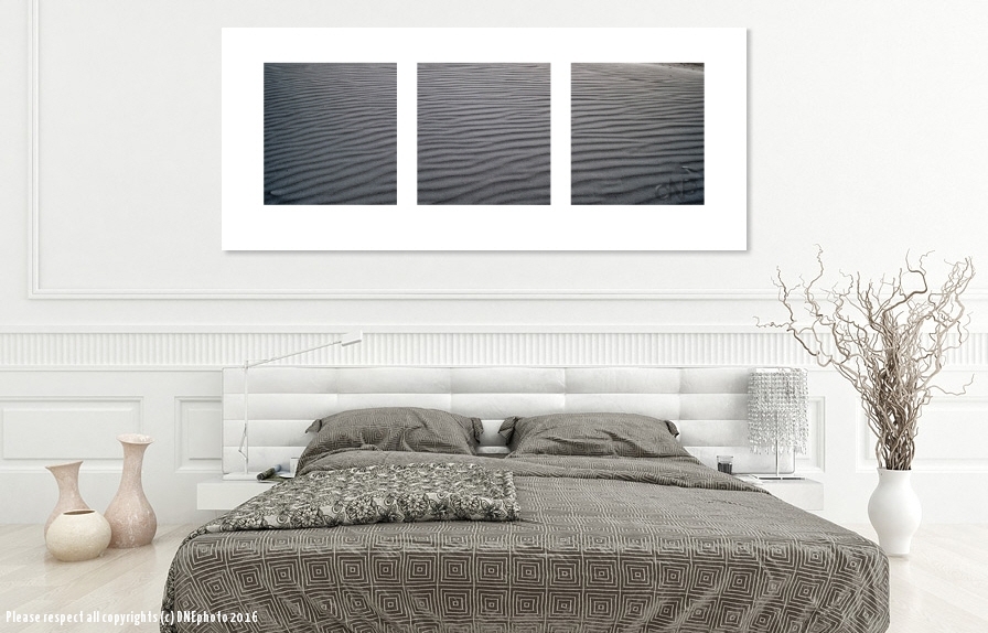
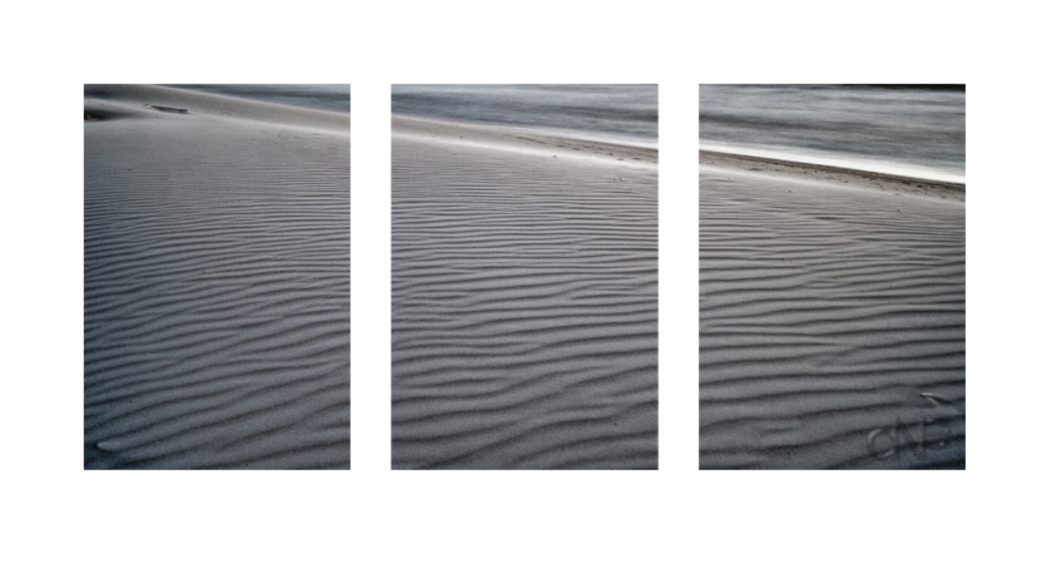
Using a triptych in design has long been used as a way to create an exaggerated effect on a wall space using a set of 3 images. The conventional way of doing this is by splitting an image into 3 equal pieces and mounting them on a wall. Hieronymous Bosch was an early user of this technique
The panels themselves become masterpieces in their own right.
Ruebens
Francis Bacon

Warhol of course could ultimately produce almost anything to both great critical and commercial success.
Photography has not found great crticial success – perhaps this is because of the medium – you essentially take 1 frame which is the image, however this does present both the photographer and the interior designer/architect with the ability to customise for specific installations.
In this example I am going to use one of my images ” Mountains of Sand” to illustrate.
Taking a “normal” image and changing it to fit the dynamics of design while creating something new with contemporary photography from renowned photographer David Epstein.
Create a unique space with this.
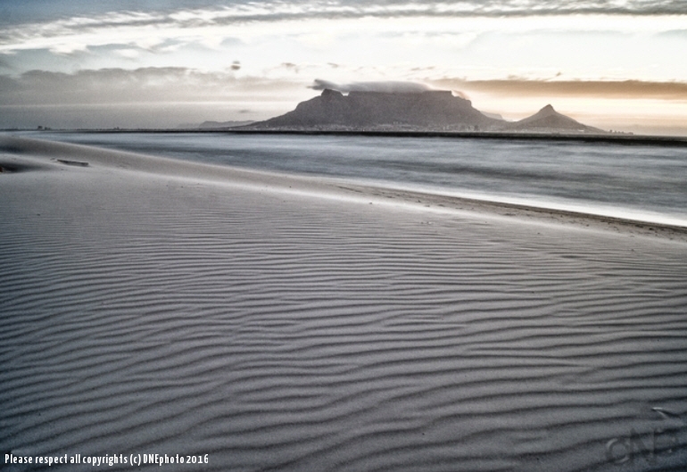
This is the original image after a bit of post-processing:
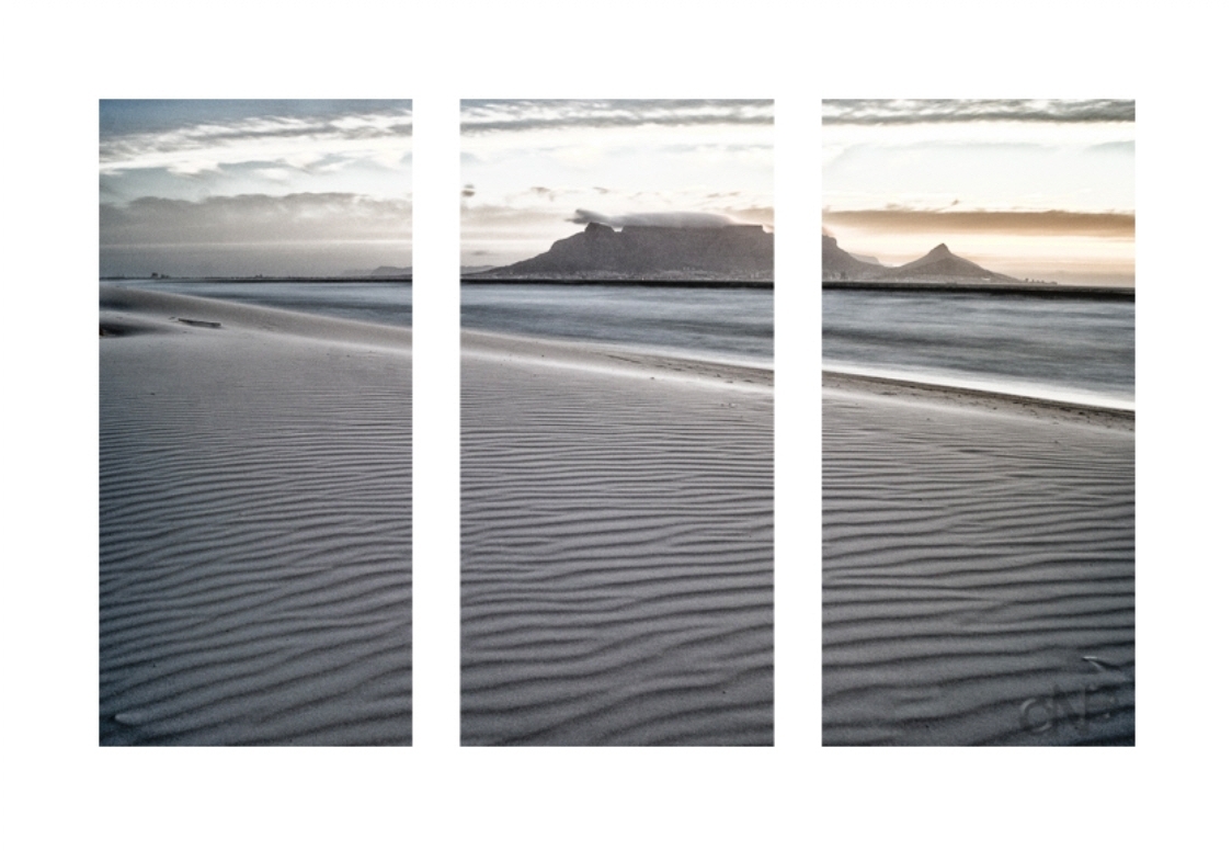
To make a traditional triptych – it would look like this:
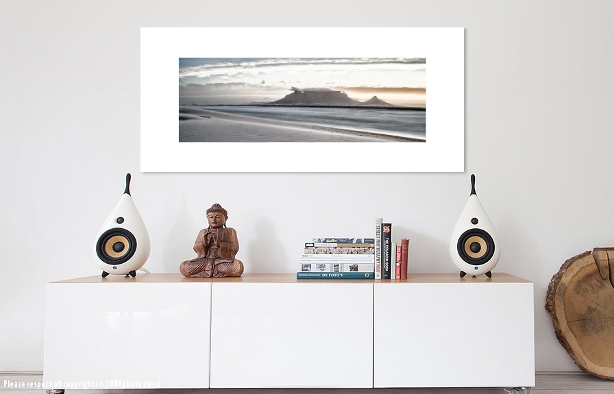
This is what the image would look like in situ:
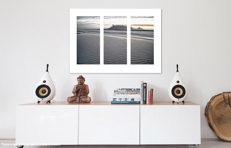
But what could be interesting is to break out some elements from that image. In this instance, there are 2 major elements – the mountain and the foreground sand.
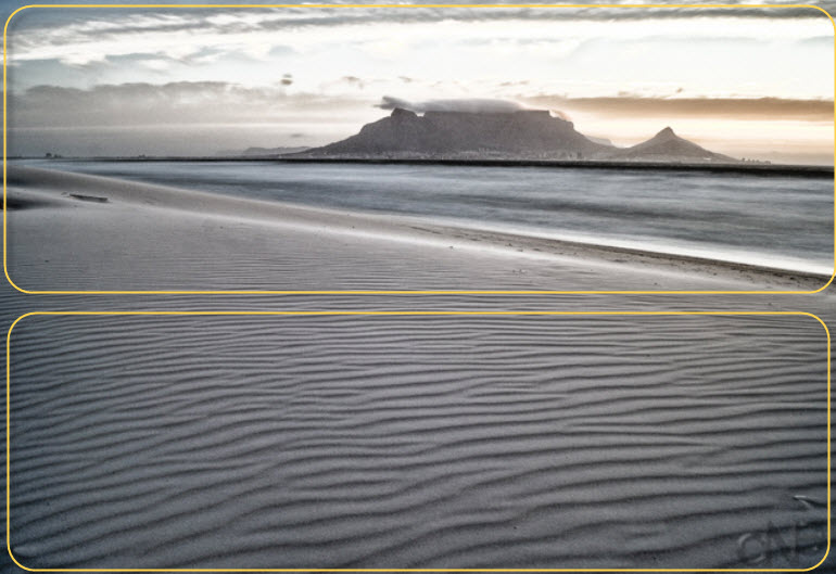
And when separated: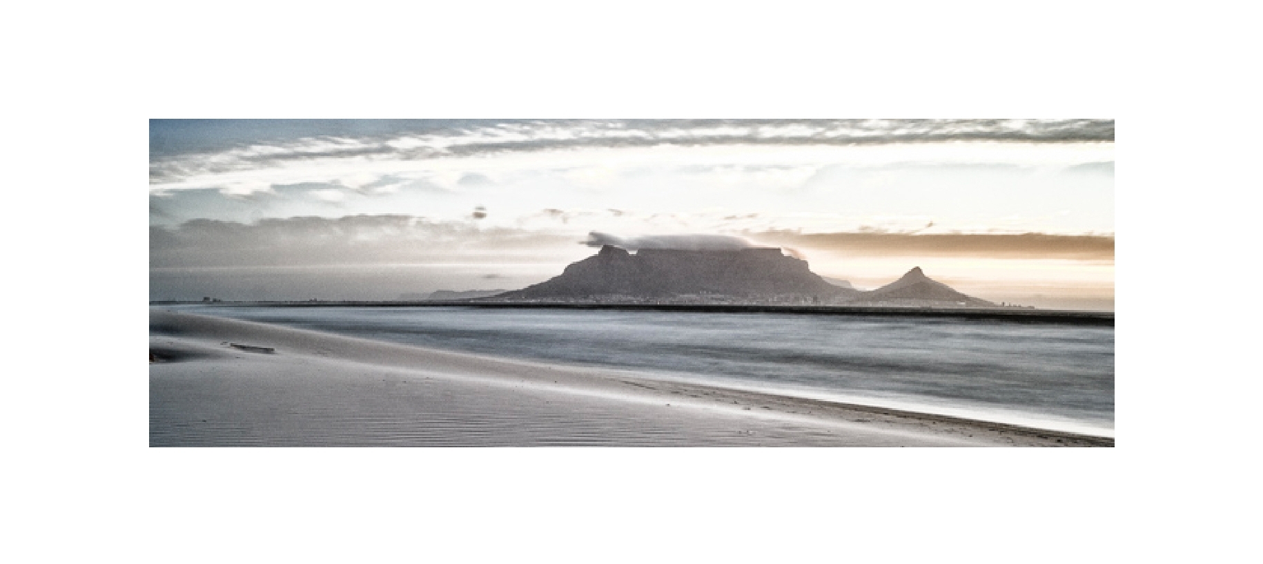
The top half with just Table Mountain and the sand element as a square triptych:
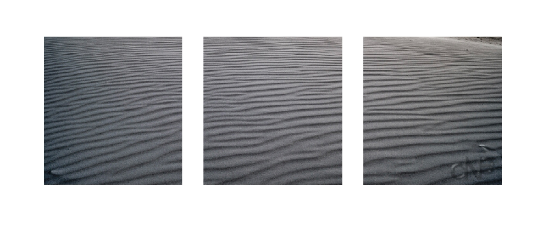
Which could then provide a synergy in different space applications:
And with the Sand Element:
